
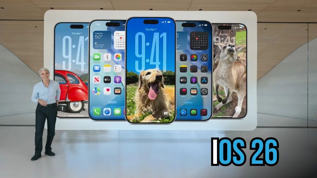
Apple’s iOS 26 introduces a major visual update with the new Liquid Glass redesign, marking the first complete overhaul of system app icons since iOS 7. This update not only refreshes the look of the iPhone home screen but also unifies app icon design across iOS, macOS, watchOS, and visionOS. With refined squircle shapes, translucent glass effects, and motion-responsive lighting, Apple has created a consistent, modern aesthetic that enhances both beauty and usability across its devices.
1. A Bold Reimagination of System App Icons
With iOS 26, Apple unveils its most ambitious icon redesign since iOS 7. The so-called “Liquid Glass” aesthetic is more than just a cosmetic refresh it signals a deeper effort to unify the visual language across Apple’s ecosystem. For the first time in nearly a decade and a half, every system app has been redrawn with updated icon artwork, reflecting Apple’s renewed emphasis on cohesion and clarity.
Summary Table
Feature |
Description |
More Info |
|---|---|---|
Icon Redesign Scope |
Complete redraw of all system app icons since iOS 7 |
|
Platform Unification |
Same artwork across iOS, macOS, watchOS, visionOS |
Built into system design guides |
Liquid Glass Aesthetic |
Glass layers with edge highlights and blur effects |
Design documentation and beta previews |
Squircle Shape Refinement |
Slightly larger corner radius, more elliptical curve |
Developer resources and UI specifications |
Motion-Reactive Lighting |
Icons adjust highlight shift when device tilts (iPhone/iPad) |
System animations and UI behavior outlines |
Launch Timeline |
Live for users upon release this fall |
Confirmed in Apple’s announcements and beta releases |
2. Unifying Icons Across All Apple Platforms
In past releases, Apple’s operating systems maintained distinct icon styles: macOS favored 3D embellishments and shadowing, iOS followed flatter designs, watchOS icons were traditionally circular, and visionOS represented icons differently altogether. iOS 26 changes that: all platforms now share the same base artwork. Mac icons adopt the iPhone’s “squircle” shape rounded rectangles with softened corners bringing design harmony. Similarly, watchOS and visionOS continue to use circular display formats, but the core icon artwork is identical simply cropped to fit.
3. The Liquid Glass Aesthetic Explained
3.1 Glass Layers and Visual Depth
The Liquid Glass design introduces translucent glass layers atop icons, offering a hint of depth and sheen. These overlay effects incorporate soft blur and edge highlighting to simulate a realistic glass surface.
3.2 Refined Squircle Shape
Apple also refines the squircle a unique rounded rectangle shape used widely for app icons. In iOS 26, the squircle’s ellipse has subtly changed: corners now sport a more pronounced radius, resulting in a gentler, more organic framing.
3.3 Motion-Reactive Lighting
One standout feature: on iPhone and iPad, Liquid Glass icons respond to device motion. As users tilt their devices, the glass overlay seems to shift with subtle directional lighting changes, enhancing the feeling of dimensionality and interactivity.
4. The Full Roster of Redesigned Icons
The following system apps have been recalibrated with the new icon design:
-
App Store
-
Books
-
Calculator
-
Clock
-
Contacts
-
FaceTime
-
Freeform
-
Home
-
Journal
-
Mail
-
Maps
-
Messages
-
Music
-
Notes
-
Passwords
-
Phone
-
Weather
-
TV
-
Tips
-
Stocks
-
Shortcuts
-
Safari
-
Reminders
-
Podcasts
-
Photos
Each icon reflects the new guidelines: unified artwork, squircle framing, glass treatment, and motion-aware lighting (where applicable).
5. Why This Redesign Matters
5.1 Platform Consistency
This is perhaps the clearest visual cue yet that Apple’s ecosystem is becoming more unified. No matter your device iPhone, Mac, iPad, Watch, or Vision you’ll now recognize the same iconography, reinforcing brand consistency and user familiarity.
5.2 Aesthetic and Functional Harmony
Liquid Glass isn’t just decorative it’s functional. The blur and highlight effects help icons stand out against various backgrounds, while motion-reactive lighting subtly contributes to a richer interaction experience.
5.3 Design Innovation
Though Apple has made aesthetic tweaks before, iOS 26’s icon overhaul is arguably its most comprehensive visual update in years. It feels intentional and forward-looking, offering both polish and personality.
6. What to Expect This Fall
When iOS 26 launches this fall, users will automatically see the updated system app icons there’s no action required. The smooth transitions, glassy overlays, and new squircle shape will be part of the everyday experience, giving the home screen a refreshed, refined look.
Frequently Asked Questions (FAQs)
1. What is the Liquid Glass redesign in iOS 26?
A. It is the new visual approach Apple is applying to all system app icons. It features translucent glass overlays, refined squircle shapes, and motion-reactive lighting to create a unified, dynamic appearance.
2. Which devices will display these new icons?
A. All supported iPhones, iPads, Macs, Apple Watches, and Vision devices adopting iOS 26, macOS version matching iOS 26, watchOS, or visionOS updates will feature the redesigned icons.
3. Do third-party app icons change too?
A. No. The redesign applies only to the system’s own pre-installed apps. Third-party developers may choose to update their icons independently, but they are not automatically included in this Apple overhaul.
4. Will these icons increase battery usage due to motion effects?
A. These subtle lighting shifts are optimized for efficiency and are unlikely to noticeably affect battery life. Apple has designed the motion responses to be smooth and low-overhead.
5. Can I disable the motion-reactive effect?
A. As of iOS 26, there is no dedicated user toggle specifically for icon motion effects. You can reduce overall motion via Accessibility settings, which may tone down these animations.
6. Why did Apple wait until now to unify the icons?
A. This redesign reflects a natural evolution in Apple’s design philosophy toward ecosystem-wide cohesion. By coordinating iconography across platforms, Apple enhances brand identity and user familiarity more important than ever as devices and interfaces converge.
Conclusion
With iOS 26, Apple delivers its most extensive icon redesign in years the Liquid Glass aesthetic. By redrawing all system icons, unifying them across devices, and introducing glass overlays and motion-reactive lighting, Apple brings a fresh, cohesive, and subtle visual upgrade to your home screen. If you’ve enjoyed aesthetic refinements and enhanced UI polish from Apple over the years, this redesign promises to be a seamless blend of beauty and functionality.
For More Information Click HERE